| Tales of the Parodyverse >> View Post |
|
| ||||||
Subj: So, what was I thinking when I drew this? Posted: Tue Dec 11, 2007 at 12:59:37 am EST (Viewed 327 times) | Reply Subj: On CSFB's costume... *slight edit* Posted: Mon Dec 10, 2007 at 11:24:46 pm EST (Viewed 1 times) | ||||||
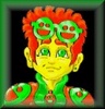
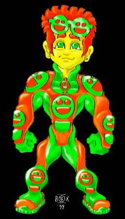
Three elements were consciously in my mind: Spider-Man's gloves, and how they "connected" to the lines of the rest of his costume; the Silver Age Green Lantern's torso, and how the shoulder pads and "underpants" were likewise "connected;" and the Generation X uniform's X-Men logo, and how it was branded on so many of the costume's circular shapes, from the shoulder pads to the zipper-pull. Really, I wanted to create a costume with a flow and a continuity of line, to set it apart from the hard divisions of the standard superhero costume's clearly defined boots, belt and "underpants." Spider-Man has that fluidity in the arms and chest of his costume, while the Silver Age Green Lantern had a more simplified version of it in the way his shoulders, midsection and below-the-belt regions were emphasized (looking back on it, it's remarkable how many ass-shots aggressively hetero hero Hal Jordan got, even back in the Silver Age ... way more than most of his fellow male heroes, then or now, and almost as much as a lot of female heroes, even by today's standards). Beyond that, I did want a balance of colors, in a way that would allow them to kind of blend into each other more organically, and the choice of orange and green came about when I decided that I wanted the colors of his costume to be mirrored in the colors of his hair and eyes. Believe it or not, the smiley-face logo was the last thing I figured out, because while I knew I wanted him to have a round symbol, that could be stuck anywhere on his costume that had a circle, I couldn't think of any design that wouldn't clash with the smooth arcs I'd made out of the rest of his costume, until I realized that a stylized version of the smiley-face could be made out of two circles and a half-circle, since both shapes were reflected in the rest of his costume. | |||||||
Posted with Microsoft Internet Explorer 7 on Windows XP
| |||||||
| |||||||
| On Topic™ © 2003-2024 Powermad Software |