| Author | ||
|
CrazySugarFreakBoy! Member Since: Sun Jan 04, 2004 Posts: 1,235 |
Subject: Superhero comic art: What if gender styles were reversed? Posted Mon Dec 10, 2007 at 01:20:55 am EST (Viewed 394 times) | |
|
| ||
|
Posted with Microsoft Internet Explorer 7 on Windows XP
Yes, we all know that artistic depictions of men and women in comics suffer from a dramatic double-standard, but this "flipside" exercise underscores it better than a lot of arguments could. vito_excalibur: IM IN UR STUDI0 DRAWIN UR D00DZ ratcreature posted an excerpt from Wizard's How to Draw: Heroic Anatomy, in response to brown_betty's request for illustrations of how bizarre illustrations of women can get in comics. And yeah, I thought we might all be able to see it clearer if we looked at it a little sideways [...]  Many, many more examples to be found by clicking the link ... | ||
|
killer shrike, not that there's anything wrong with that..... |
Subject: That would be gay [Re: CrazySugarFreakBoy!] Posted Mon Dec 10, 2007 at 08:25:26 am EST | |
|
| ||
|
Posted with Microsoft Internet Explorer 7 on Windows Vista
| ||
|
Visionary |
Subject: I can probably comment on a lot of this, but it will have to wait until after work. [Re: CrazySugarFreakBoy!] Posted Mon Dec 10, 2007 at 08:42:10 am EST | |
|
| ||
|
Posted with Mozilla Firefox 2.0.0.11 on Windows XP
| ||
|
Visionary |
Subject: And now some quick thoughts... [Re: Visionary] Posted Mon Dec 10, 2007 at 10:38:42 pm EST (Viewed 1 times) | |
|
| ||
|
Posted with Mozilla Firefox 2.0.0.11 on Windows XP
Heh... these are pretty good, and definitely cute. It reminds me of a few things: Years and years ago, there was a controversy at the Avengers Message Board when a female poster complained about the banner... one of those images where someone painted a costume on a photo of some naked woman reclining in the sheets. The argument was that it made the poster uncomfortable, and that many guys would be uncomfortable having to face down a slutty male porn picture at the top of the board. The pro-slutty woman banner fans shot down the people who said they'd submit male banners, on the grounds that: a) There was no evidence that the female image, tawdry as it was, was from actual porn... porn would be rejected. b) It wasn't out of character for this heroine to be depicted in such a sultry scene, while it would be for Cap or whomever. (A whole other can of worms, really) So I made a banner repainting Michaelangelo's "Dying Slave" sculpture to be Starfox peeling up his shirt.  Lisa passed it on to 'Dox, who thought it was funny, but it somehow never made the banner rotation... Lisa passed it on to 'Dox, who thought it was funny, but it somehow never made the banner rotation...Another incident would be a discussion I had with someone over the "gayness" of the "Superman Returns" costume. This person stated that all opposition to the costume was born over homophobic reaction to the openly gay director. I suggested that, while I was sure that was indeed driving quite a bit of it, observed objectively the costume *was* a more "gay" interpretation of the classic outfit. My reasoning was this: Male and female sexuality is traditionally expressed in different ways, especially in poses and clothing that emphasizes differences in body types. When you reverse these traditions, you project the opposite gender onto the subject and people's brains react accordingly. A man in a sultry, "feminine" pose tells the male viewer's brain that the figure is trying to entice him... hence, it would be gay. Generally, people who are uncomfortable with that don't react well to the switch... Getting back to Superman, in the heroic male, one stresses the stability of horizontals... especially the broadness of the chest... something the classic "S" shield does perfectly. In Superman Returns, this shield was made smaller. Additionally, they lowered his belt, stretching out his torso and shifting emphasis from the chest down to the abdomen... an area more stressed for women's sexuality than men's. (Whenever comedies want to dress a hetero guy in a "gay" outfit, high on the fashion list would be belly shirts of some kind.) Case in point... Compare these three images: Christopher Reeve Supes:  Superman Returns Supes:  Crazily overdone sexual Supergirl statue:  Now... which of those costumes invite you to let your attention drift lower... lower... lower... Not that there's anything wrong with any of this, mind you... I absolutely love Michaelangelo's work, but there's no doubt it's super-gay. He didn't hesitate to put the male form into those very poses that the comic-art post mocks. And really, quite often that's art... you project and emphasize the thing that attracts you into your own work. As such, that disparity between the poses will remain until the market is made up of enough creators and enough of an audience to really demand men in sensuous poses. | ||
|
CrazySugarFreakBoy! Member Since: Sun Jan 04, 2004 Posts: 1,235 |
Subject: Interesting ... [Re: Visionary] Posted Mon Dec 10, 2007 at 10:52:14 pm EST (Viewed 366 times) | |
|
| ||
|
Posted with Microsoft Internet Explorer 7 on Windows XP
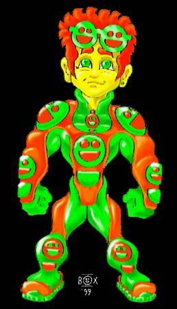
... Especially the behind-the-scenes politics of the board. I seem to recall one of the defenders saying that George Perez was a fan of the digitally manipulated porn girls as superheroes, but then again a) Perez was the guy who drew Wanda without panties, and b) Perez is the guy who drew Peter Parker and Dick Grayson in an even more sexually suggestive scene, so I'd say he's a bit of an equal-opportunity offender, which is probably one of the reasons I think he's FUCKING AWESOME. Oh, and with that subtextual reading of the Superman costume, I wonder what you'd have to say about, oh, I don't know, an orange and green costume that de-emphasizes the chest even more ... | ||
|
Visionary |
Subject: On CSFB's costume... *slight edit* [Re: CrazySugarFreakBoy!] Posted Mon Dec 10, 2007 at 11:24:46 pm EST (Viewed 1 times) | |
|
| ||
|
Posted with Mozilla Firefox 2.0.0.11 on Windows XP
 Well, as drawn it's actually a very masculine design... The anatomy de-emphasizes the torso in favor of the limbs and head, while the torso is as broad across the shoulders as it is high from crotch to neck. The division of color breaks up the outfit pretty evenly, although the strength of the arms is stressed in their relative size and the large shell of orange. Projected onto a more realistic male body, I'd say it comes across as fairly asexual... The even distribution of orange and green breaks up the form without focusing attention on any particular feature. It could be "pushed" to emphasize most anything if an artist so desired, so I would expect that a variety of artists would find the costume very malleable... Those who wanted a sensual bend would be able to shift shapes around slightly to achieve it, while those who wanted a more rugged look could likewise find it. *edit* One addendum: The lack of a belt line to break the abdomen from the crotch would likely make a sexual bend to it harder to avoid... so "asexual" is probably off the mark. Still, there's the possibility for a wide range of takes on this same design. | ||
|
CrazySugarFreakBoy! Member Since: Sun Jan 04, 2004 Posts: 1,235 |
Subject: So, what was I thinking when I drew this? [Re: Visionary] Posted Tue Dec 11, 2007 at 12:59:37 am EST (Viewed 348 times) | |
|
| ||
|
Posted with Microsoft Internet Explorer 7 on Windows XP
Three elements were consciously in my mind: Spider-Man's gloves, and how they "connected" to the lines of the rest of his costume; the Silver Age Green Lantern's torso, and how the shoulder pads and "underpants" were likewise "connected;" and the Generation X uniform's X-Men logo, and how it was branded on so many of the costume's circular shapes, from the shoulder pads to the zipper-pull. Really, I wanted to create a costume with a flow and a continuity of line, to set it apart from the hard divisions of the standard superhero costume's clearly defined boots, belt and "underpants." Spider-Man has that fluidity in the arms and chest of his costume, while the Silver Age Green Lantern had a more simplified version of it in the way his shoulders, midsection and below-the-belt regions were emphasized (looking back on it, it's remarkable how many ass-shots aggressively hetero hero Hal Jordan got, even back in the Silver Age ... way more than most of his fellow male heroes, then or now, and almost as much as a lot of female heroes, even by today's standards). Beyond that, I did want a balance of colors, in a way that would allow them to kind of blend into each other more organically, and the choice of orange and green came about when I decided that I wanted the colors of his costume to be mirrored in the colors of his hair and eyes. Believe it or not, the smiley-face logo was the last thing I figured out, because while I knew I wanted him to have a round symbol, that could be stuck anywhere on his costume that had a circle, I couldn't think of any design that wouldn't clash with the smooth arcs I'd made out of the rest of his costume, until I realized that a stylized version of the smiley-face could be made out of two circles and a half-circle, since both shapes were reflected in the rest of his costume. | ||
|
HH |
Subject: Let's not forget that Perez married an exotic dancer and actually used her as his model for a couple of his... spicier comic strips. [Re: CrazySugarFreakBoy!] Posted Thu Dec 27, 2007 at 08:03:29 am EST | |
|
| ||
|
Posted with Microsoft Internet Explorer 6 on Windows 2000
|
